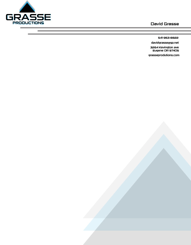
Project Corrections / Time Spent: I spent a good hour analyzing my brochure to see what I could do to help the gate fold. I eventually altered some things along the edge to help it close better. I spent the other hour looking at the event ad and montage. I ended up not changing the event ad, but I cleaned up the montage a tiny bit
Message: I want to showcase my work through the semester. I don’t consider all of my work to be the best by any means, but I feel like it shows how much I’ve progressed.
Audience: Potential client and employers.
Top Thing Learned: To keep past work to see how far you’ve come in case you get discouraged. You should sketch out ideas before you get on the computer.
Future application of Visual Media: I want to be able to take this with me into my career in video production.
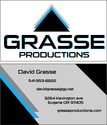
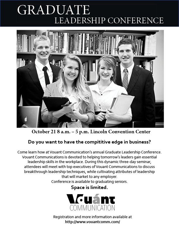
Color scheme and color names: Monochromatic, grayscale
Title Font Name & Category: Lemon Milk – San Serif
Copy Font Name & Category: Ingleby Regular – Oldstyle
Thumbnails of Images used:
Sources (Links to images on orginal websites): https://newevolutiondesigns.com/30-hd-black-wallpapers